
Design Your Home Screen

Introduction
By focusing on creating customer-friendly design blocks, businesses can effectively cultivate long-lasting relationships with their customers. These design blocks serve as a crucial tool in engaging customers and keeping them satisfied with the products or services offered.
Emphasizing the importance of user-friendly interfaces and intuitive designs can lead to increased customer loyalty and repeat business.
In this Article
- How to add different Block types?
- How do different Action Types work?
- How to delete a Block?
- How to rearrange your Blocks?
- How to Configure different types of Blocks?
- Announcement Bar
- Welcome Block
- Recently Ordered
- Upcoming Subscription
- Quick Links
- Collections
- Collection with Products
- Featured Collection
- Featured Product
- Banner
- Banner Carousel
- Media
- Media Carousel
- Promotion Heading
- USP Blocks
- Icon Text CTAs
- List
- Blog Post
- Blog Carousel
- Multilevel Categorization
- Multi Content
How to add different Block types?
Step 1: On the top right corner of the screen, you can find the “Add Block” button. Click on it to select the desired block.

Step 2: Select the desired Block Type and click on Add.

Step 3: You have now successfully added your block. Follow the instructions given here to configure different block types.
How to delete a Block?
- You can also delete the block types from the Home Screen using the "Bin Icon" on the right.

- If you wish to delete the block while configuring your block type, simply click the "Delete Block" button at the bottom of your edit screen.

How to rearrange your Blocks?
You can rearrange your blocks from the main screen, i.e., design a home screen with simple drag and drop.
How do different Action Types work?
Refer to this article to learn how different Action Types work.
How to configure different Block types on your Home Page?
Announcement Banner
Please note that you can only add the Announcement Bar once on your Home Page.
Description
- Place an announcement bar at the top of your home page to convey important messages or updates to your customers.
- Customize the text to highlight promotions, discounts, new features, or any other relevant information.
- Make it visually distinct from the rest of the content to ensure it catches the customer's attention.
- Include a call-to-action button if necessary, directing customers to take specific actions related to the announcement.
How to Configure
Step1: Select the Block Type "Announcement Banner"

Step 2: Enter the Announcement text

Step 3: Select the background color and text color
Step 4: Select action types
Refer to this article to learn how different Action Types work.
Step 5: Save and you are done.
Preview

Benefits: Increases customer engagement by effectively communicating important information, leading to higher conversion rates and customer satisfaction.
Welcome Block
Please note that you can only add the Welcome Block once on your Home Page.
Description
Utilize the Welcome Block to create a personalized experience for existing customers.
How to Configure
Step1: Select the Block Type "Welcome"

Step 2: Click on Add and you are done.
Preview

Benefits: Enhances customer onboarding experience, fosters a sense of belonging, and increases customer retention by establishing a connection with customers.
Recently Ordered
Please note that you can only add the Recently Ordered Block once on your Home Page.
Description
Showcase recently ordered products to encourage repeat purchases and facilitate quick access to previously browsed products.
How to Configure
Step 1: Go to the Features Tab

Step 2: In the Personalized Home screen section, enable "Buy Again Rail"

Step 3: Now on the Home Page, select the Block Type "Recently Ordered "

Step 4: Click on Add and you are done.
Preview

Benefits: Improve customer engagement by providing personalized product recommendations, boost sales by promoting relevant items, and enhance customer convenience by facilitating quick access to previous orders.
Upcoming Subscription
Please note that you can only add the Upcoming Subscriptions bar once on your Home Page.
Description
Displays upcoming subscription orders allowing your customers to manage or add to upcoming subscriptions.
How to Configure
Step 1: Go to the Integrations Tab
Step 2: Under the Subscriptions & Memberships, select the 3rd party you wish to integrate such as Recharge, Loop, Prive, etc
Step 3: Turn on the integration and Save
Step 4: Now select the Block Type "Upcoming Subscriptions"

Step 5: Click on Add and you are done.
Preview

Benefits: Simplify subscription management and increase Average Order Value by encouraging customers to add items to upcoming deliveries, leading to recurring revenue.
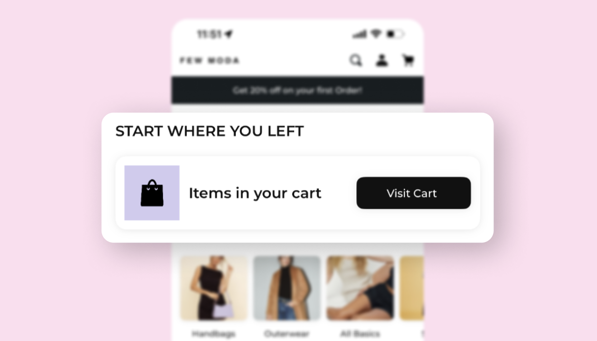
Quick Links
Description
- Create a section with quick links to essential features or pages within the app like last purchase, View cart, and more.
- Organize links in a visually appealing manner for easy access.
How to Configure
Step 1: Select the Block Type "Quick Links"

Step 2: Enter Block Title
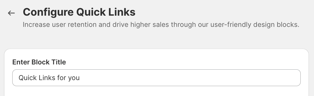
Step 3: Go to Add link

Step 4: Enter the text
Step 5: Select Action Type and save
Refer to this article to learn how different Action Types work.
Preview

Benefits: Enhances customer convenience by providing quick access to frequently used features, and improving navigation within the app.
Collections
Description
- Showcase curated collections of products based on themes or categories for your customers.
- You may include visually appealing images or icons representing each collection.
P.S. You can choose from different layout types such as rectangular, circular, and Grid based on your preference.
How to Configure
Step 1: Select the Block Type "Collection List (Rectangular)"

Step 2: Enter Block Title

Step 3: Select Image Aspect Ratio
Step 4: Choose the collection you want to display and save

- Collection List (Rectangular)

- Collection List (Circular)

- Collection List (Grid)

Benefits: Helps customers discover relevant content or products based on their interests, leading to increased engagement and conversion rates.
Collection with products
Description
With this block type, you can feature a specific collection along with its associated products
How to configure
Step 1: Select the Block Type "Collection with products"

Step 2: Enter Block Title
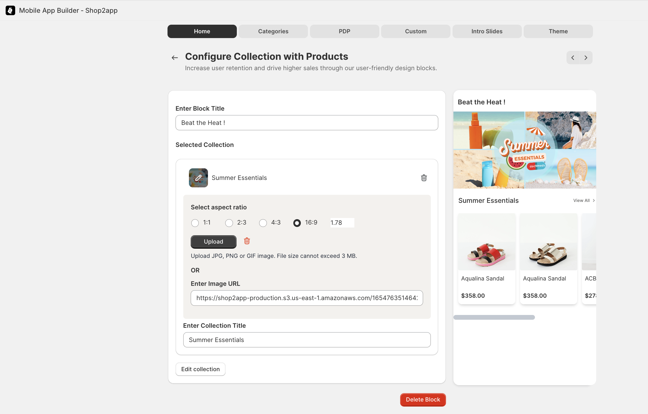
Step 3: Select the image aspect ratio
Step 4: Upload your Image or Enter the Image URL
Step 5: Add the collection title
Step 6: Choose the collection you want to display and save
Preview
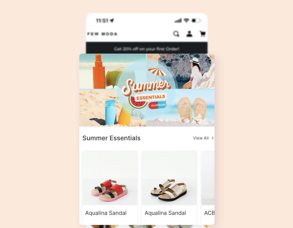
Benefits: Highlights specific product offerings, increases visibility, and encourages customers to explore and make purchases within the collection.
Featured Collection
Description
Highlight a particular collection that you want to promote prominently like New launches, app-exclusive collections, or upcoming sales
How to configure
Step 1: Select the Block Type "Featured Collection"

Step 2: Enter Block Title
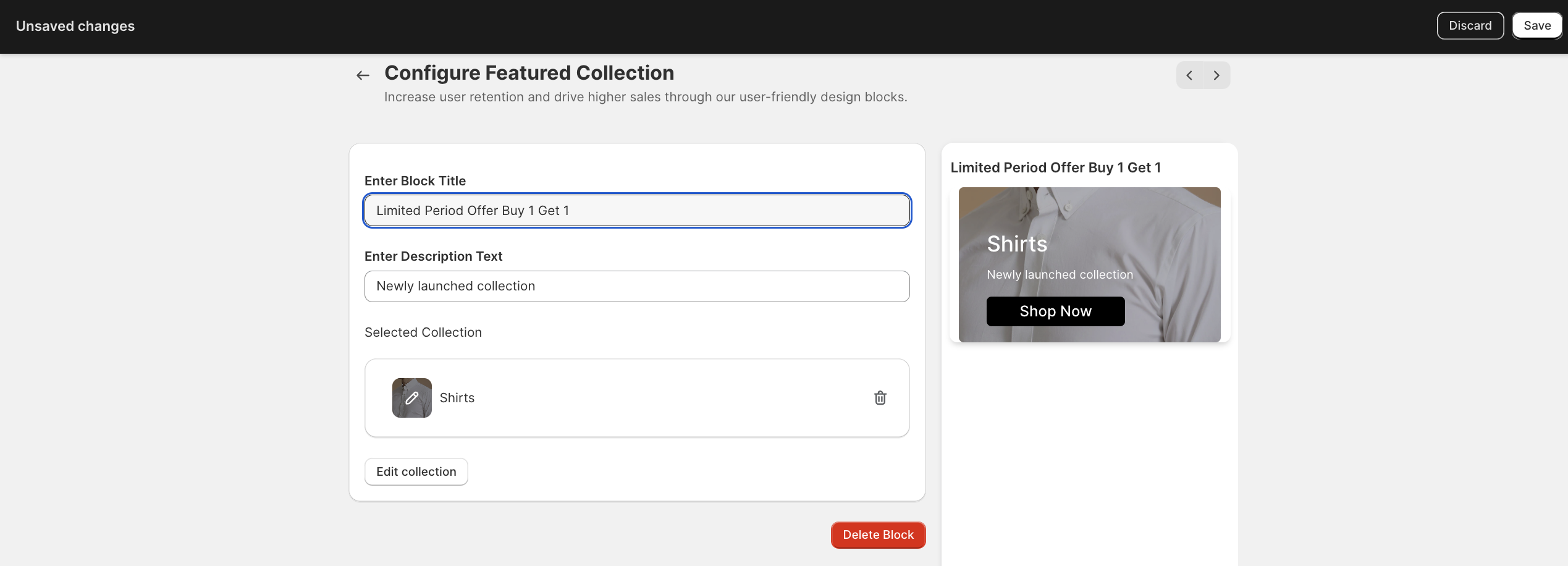
Step 3: Enter the Description text
Step 4: Choose the collection you want to display and save
Preview
Benefits: Increases the visibility of selected collections, drives traffic to specific product categories, and boosts sales for featured collections.
Featured Product
Description
Showcase a standout product that you want to highlight.
How to Configure
Step 1: Select the Block Type "Featured Product"

Step 2: Enter Block Title

Step 3: Select the Product

Step 4: Select the Aspect Ratio and save
Preview

Benefits: Increases product visibility, and drives sales for featured products.
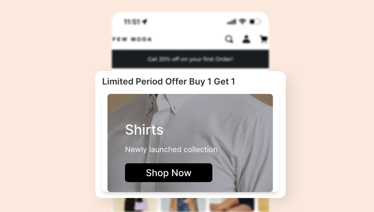
Banner
Description
- Use banners to promote special offers, sales, or events.
- Include visually striking graphics and concise, attention-grabbing messages.
- Ensure banners are clickable, leading customers to relevant pages or actions.
How to configure
Step 1: Select the Block Type "Banner"

Step 2: Enter the Block Title
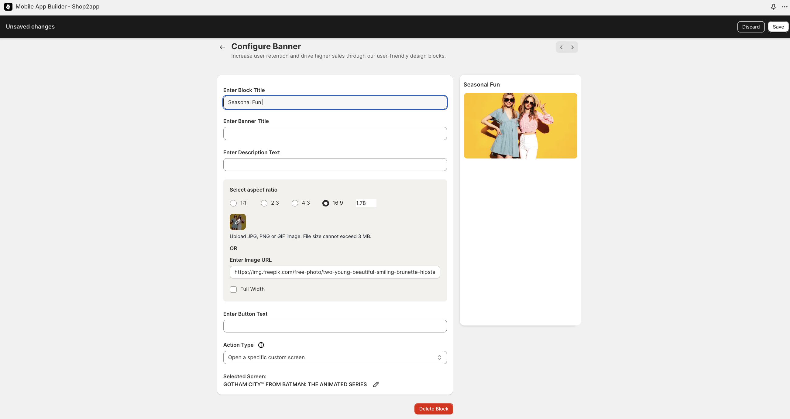
Step 3: Enter the Banner title and description text
Step 4: Upload the image or Enter the Image URL
Step 5: Select the aspect ratio
Step 6: Enter Button text
Step 7: Select the action type and save
Refer to this article to learn how different Action Types work.
Preview
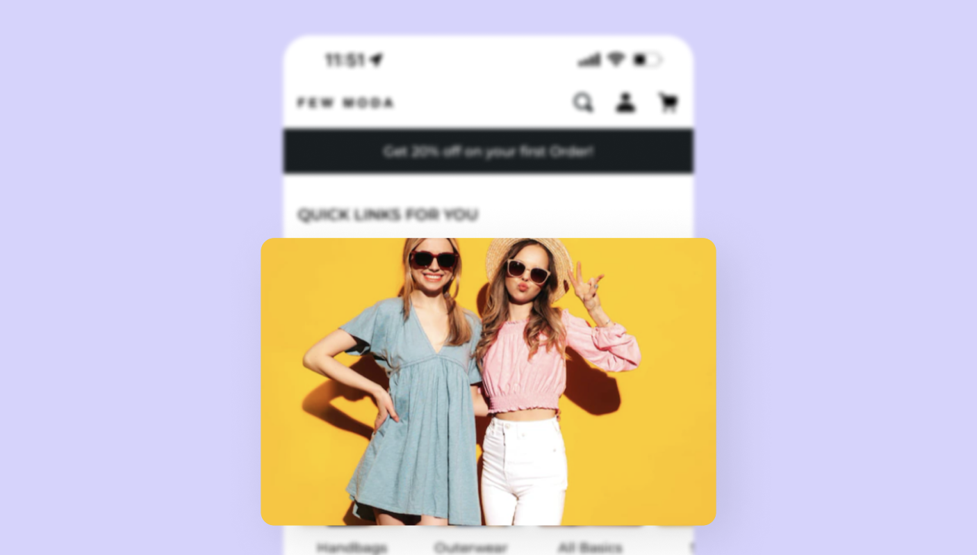
Benefits: Grabs customers' attention, communicates promotional messages effectively, and drives traffic to targeted pages or actions.
Banner Carousel
Description
Implement a carousel of banners featuring various promotions, newly launched products, or important announcements. Allowing customers to swipe or tap through the banners to view different messages.
How to configure
Step 1: Select the Block Type "Banner Carousel"

Step 2: Upload your image and enter the Banner Title

Step 3: Enter the description text
Step 4: Enter Button text
Step 5: Select the action type and save.
Refer to this article to learn how different Action Types work.
Preview

Benefits: Maximizes space by displaying multiple promotions in a compact format, grabs customer attention, and drives engagement with clickable banners.
Media
Description
Incorporate multimedia elements such as videos or photos to showcase special promotions, events, and announcements, or simply to engage the customer with eye-catching visuals.
How to Configure:
Step 1: Select the Block Type "Media"

Step 2: Enter the Block title and media title.
Step 3: Either Enter the Video Thumbnail URL or Upload the Image Thumbnail.
Step 4: Select Aspect ratio

Step 5: Enter Video Source or Enter Media ID
Step 6: Enter Tags
Step 7: Add Products and Save.
Preview

Benefits: Enhances customer experience with visually rich content and communicates brand identity effectively.
Media Carousel
Description
Use a carousel to showcase multimedia content such as images, videos, or slideshows. Include visually compelling media related to products, brand storytelling, or customer-generated content.
How to configure
Step 1: Add the Block type "Media Carousel"

Step 2: Enter the Media Title

Step 3: Enter the Video Source
Step 4: Upload Your Media or Enter the Image URL
Step 5: Add Products and Save.
Preview

Benefits: Captivates customers with engaging visuals, communicates brand identity effectively, and enhances customer experience with interactive content.
Promotion heading
Description:
- Display a prominent heading highlighting ongoing promotions, sales, or special offers.
Provide a brief description or call-to-action related to the promotion.
How to Configure
Step 1: Select the Block Type "Promotion Heading"

Step 2: Enter the Block title and heading.

Step 3: Enter Description Text
Step 4: Enter Button Text
Step 5: Upload the Image or Enter the Image URL
Step 6: Select the aspect ratio
Step 7: Select Action type and Save.
Refer to this article to learn how different Action Types work.
Preview

Benefits: Draws attention to promotional campaigns, encourages customer engagement with special offers, and drives conversion rates.
USP Blocks
Description
- Showcase the unique features or benefits of your products or services.
- Highlight key selling points such as quality, affordability, or convenience.
How to configure
Step 1: Select the Block Type "USP Blocks"

Step 2: Upload the Image and select the background color

Step 3: Enter title and Description Text
Step 4: Select Action type and Save
Refer to this article to learn how different Action Types work.
Preview

Benefits: Differentiate your brand from competitors, build customer trust by highlighting strengths, and influence purchase decisions.
Icon Text CTAs
Description
- Utilize icons paired with text to create visually appealing call-to-action buttons.
Place CTAs strategically to prompt desired customer actions such as "Shop Now" "Learn More" "Sign Up” or “ Go to Cart”
How to configure
Step 1: Select the Block Type "Icon Text CTA"

Step 2: Upload the Image
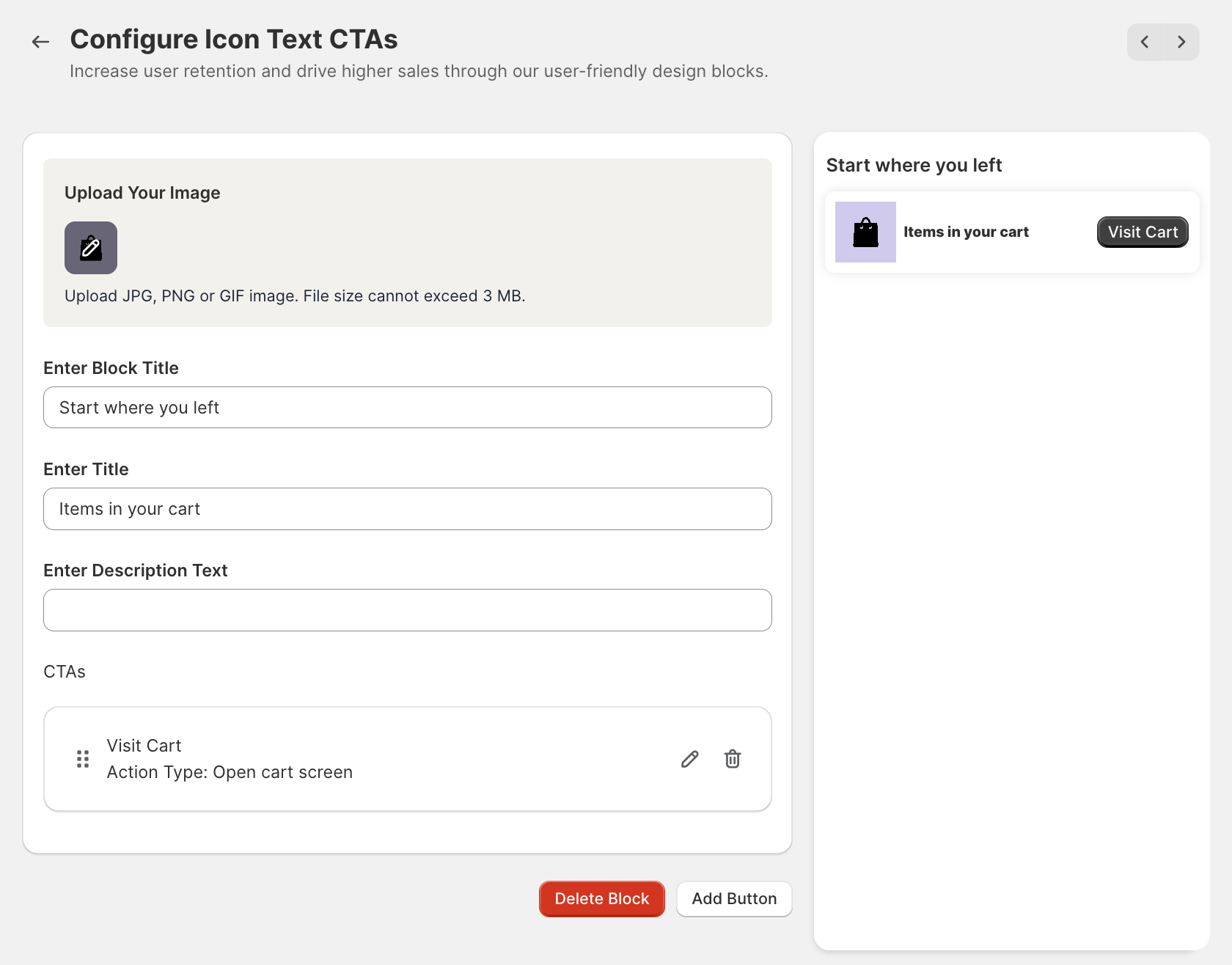
Step 3: Enter the Block Title
Step 4: Enter Title and Description Text
Step 5: Add the CTA Button(s) and Save
Preview
Benefits: Increases click-through rates by making CTAs more noticeable and actionable, guiding customers towards desired actions effectively.
List
Description
- Display a list of curated features or benefits for easy browsing.
- Organize items in a visually appealing manner with clear headings and descriptions.
How to configure
Step 1: Select the Block Type "List"

Step 2: Enter Block Title
Step 3: Enter List Title
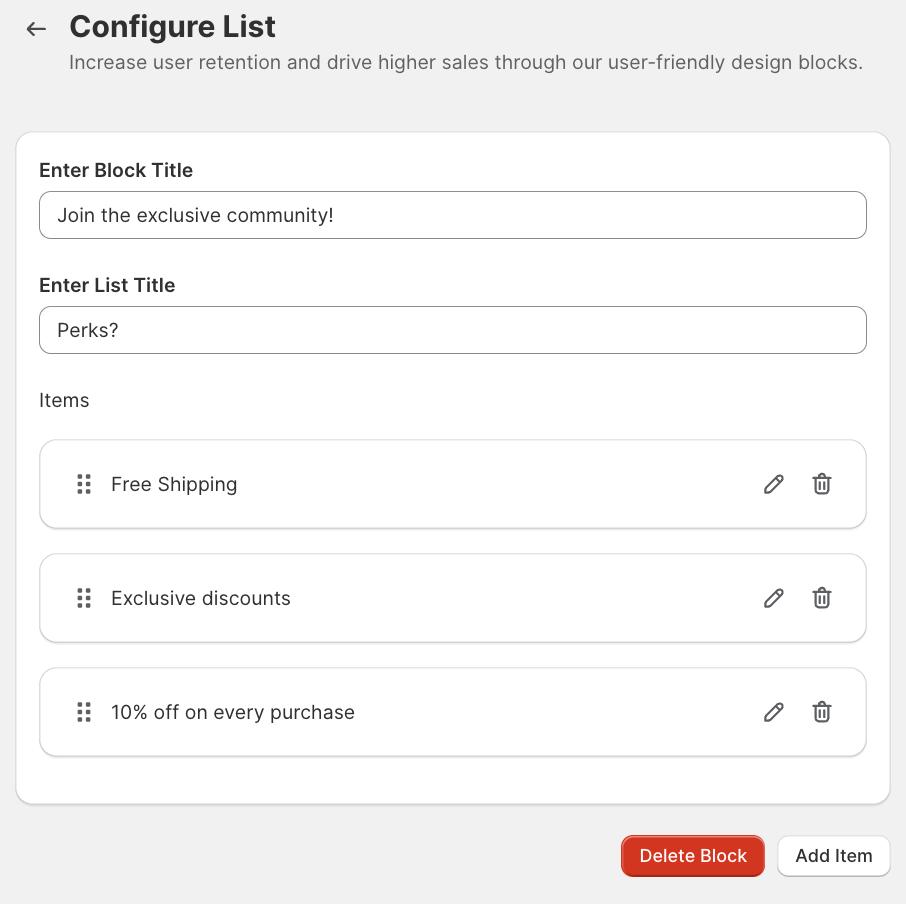
Step 4: To add another. item, click on "Add Item" enter text, and click on Save.

Preview

Benefits: Simplifies delivery of information to the customers, and facilitates desired information.
Blog Post
Description
- Feature blog posts or articles related to your industry, products, or brand.
- Include fun titles, featured images, and summaries to attract customer interest.
How to configure
Step 1: Select Block type "Blog Post"

Step 2: Enter the block title

Step 3: Enter your tags and select the desired Blog and Save
Preview

Benefits: Drives traffic to your blog or content hub, positions your brand as an authority in your niche and enhances customer engagement with informative content.
Blog Carousel
- Blog Carousel (Circular)

- Blog Carousel (Rectangular)

- Blog Carousel (Grid)

Description
- Implement a carousel-style display that showcases various Blog posts.
- Include visually appealing thumbnails or featured images for each Blog post.
- Provide titles of the Blog content to give customers a glimpse of what each post covers.
How to configure
Step 1: Add the Block Type "Blog Carousel"

Step 2: Enter Block Title

Step 3: Enter Tags
Step 4: Upload the image
Step 5: Go to Add Blog, select the Blog you wish to add and Save.
Preview
Benefits: Enhances customer engagement by offering a visually appealing and interactive way to showcase blog content, encourages customers to explore multiple posts, drives traffic to your blog or content hub, and strengthens brand credibility by providing valuable and informative content to customers.
Multilevel Categorization
- Collection Group (Rectangular)

- Collection Group (Circular)

- Collection Group (Grid)

Description
- Organize the Collection of products into hierarchical categories for easy navigation.
- This enables customers to explore products within main categories to find relevant items.
How to configure
Step 1: Select the Block Type "Group of Collection List (Circular)"

Step 2: Enter the Block Title and Add Group

Step 3: Enter Group Title

Step 4: Upload the Image or Enter the Image URL
Step 5: Add Group Collections and save
Preview

Benefits: Improves customer experience by simplifying content discovery, helps customers find specific items efficiently, and reduces friction in navigation.
Multi Content
Description
- Incorporate a section that displays a mix of different content types such as products, promotions, or blog posts.
Use a visually balanced layout to showcase various content elements effectively.
How to Configure
Step 1: Select the block Type "Multi Content"

Step 2: Enter the Block Title and Title

Step 3: Enter the Description Text and Select the background color
Step 4: Enter Grid/Vertical/Bottom CTA's
Step 5: Enter CTA text
Step 6: Upload the Image
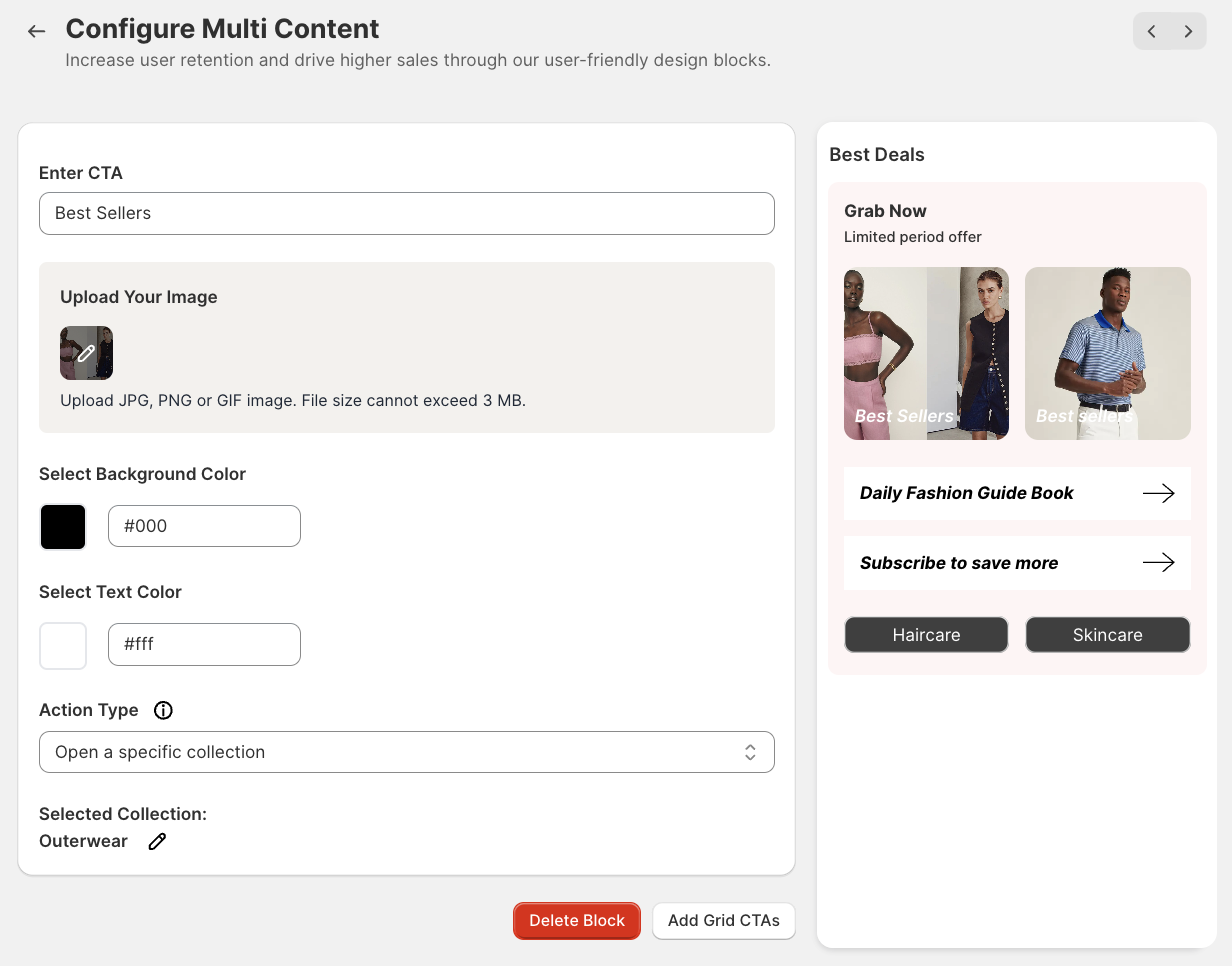
Step 7: Select Background Color and Text Color
Step 8: Select Action Type and Save
Refer to this article to learn how different Action Types work.
Preview

Benefits: Provides customers with diverse and engaging content, increases time spent on the app, and encourages exploration of different sections.
If you have any questions or need further assistance, feel free to contact us at help@shop2app.com.
Happy selling!