.png)
Getting Started with App Design

In this Article
- Adding Different Block Types
- Search relevant Block Types
- Duplicating Your Blocks
- Deleting a Block
- Rearranging your Blocks
- Scheduling Block Visibility
- Customizing Block Visibility
- Implementing Action Types
Adding Different Block Types
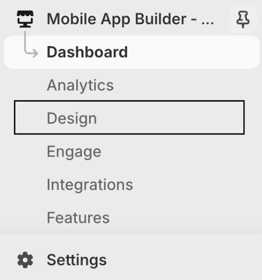
Step 1: Under Mobile App Builder, navigate to the "Design" Tab
Step 2: On the top right corner of the screen, you can find the “Add Block” button. Click on it to select the desired block.

Step 3: Select the desired Block and click on "Add"

Step 4: You have now successfully added your block. Follow the instructions given here to configure different block types
Search relevant Block Types

Step 1: You can search for the block you'd like to add and click on "Add"
Step 2: Follow the instructions given here to configure different block types
Please note that you can search based on Name and Tags
Duplicating Your Blocks
Please note that you cannot duplicate blocks such as the Announcement Bar, Welcome Block, Recently Ordered, and Upcoming Subscription.
To duplicate any block type click on the (+) icon

Deleting a Block
- You can delete the block from the Shop Screen using the "Bin Icon"

- If you wish to delete the block while configuring your block type, click the "Delete Block" button at the bottom of your edit screen

Rearranging your Blocks
You can rearrange your blocks from Shop with simple drag-and-drop
Scheduling Block Visibility
The Scheduling Block Visibility feature allows you to control when specific blocks appear on your app. By setting visibility schedules, you can automate the display of promotional banners, special offers, announcements, or any other content based on specific dates and times. This ensures your content is always relevant and timely, helping to drive engagement and conversions. Whether you're running a limited-time sale, launching a new product, or promoting seasonal campaigns, this feature gives you the flexibility to manage content visibility.
Step 1: Go to Schedule Visibility and turn on the toggle

Step 2: Now, select the Start Date and Time

Step 3: Similarly select the End Date and Time and Save
Customizing Block Visibility
This feature provides flexibility in displaying specific content blocks on your app based on the customer's login state and customer tags.
Step 1: Under Visibility Conditions, Go to Block Visibility
Step 2: Click on it

Step 3: Choose from the following visibility conditions and Save
Visible only to users with selected customer tags
The block will be visible to customers tagged with above value.
- Visible to users who are logged in
- Visible to users who haven't logged in

Implementing Action Types
Action Types help you choose where you want to lead customers when they tap on a particular block
Refer to this article to learn how different Action Types work
If you have any questions or need further assistance, feel free to contact us at help@shop2app.com.
Happy selling!